A complete redesign of the Virtuoso client experience on Virtuoso.com.
Goals for the redesign of Virtuoso.com were:
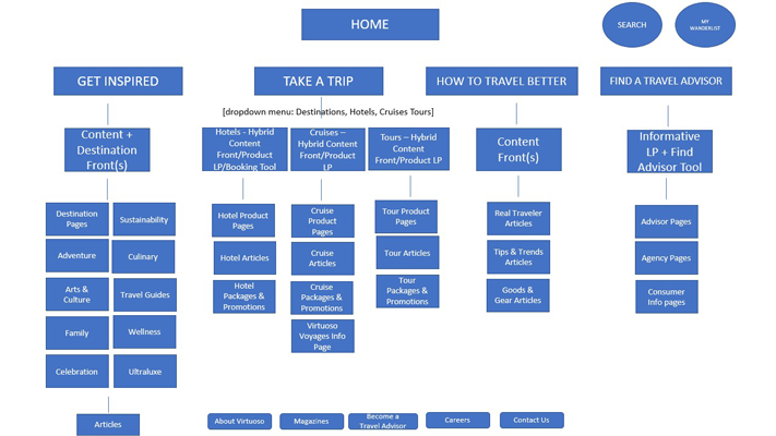
As the design point person for B2C, I took ownership of the redesign of the concept mapping, wireframes, and visual design of all pages previously mentioned. I shared responsibility in the process of performing user interviews, research and final usability tests with one other teammate.
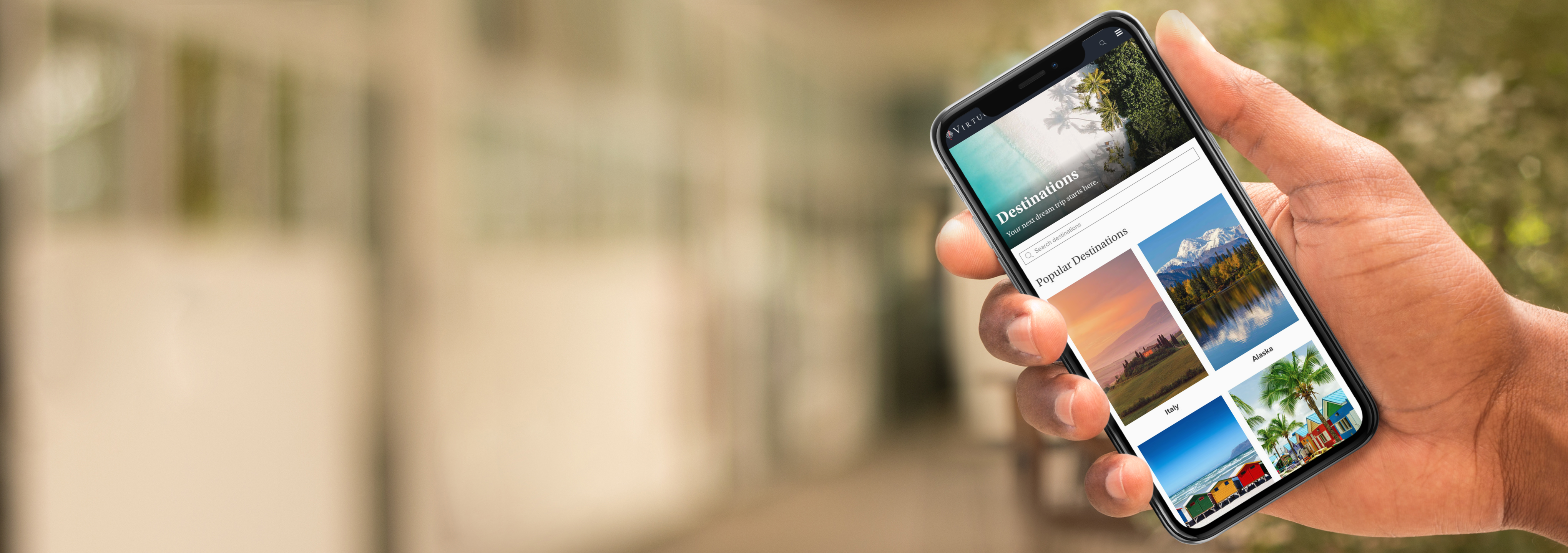
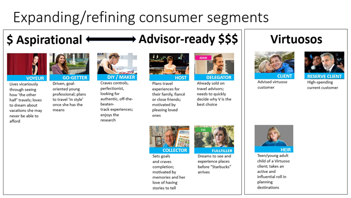
I leveraged much of the data collected from the design sprint of expert interviews which included the CEO, product owners, marketing executives, engineers, designers, etc. All came together to answer questions about the nature of the business and challenges Virtuoso is facing. Participants created How Might We statements that framed problems as potential opportunities, followed by a mapping exercise to identify all the users pain points along their journey.
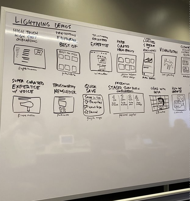
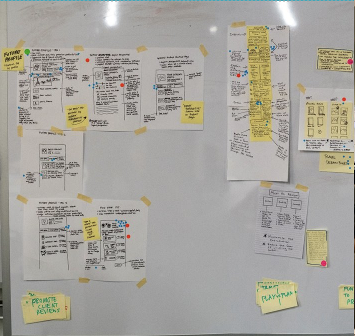
Sketching helped to identify areas that sprint participants found interesting. Heat mapping was done on the sketches to form hot spots around the most popular ideas and voting took place to decide on the best solution to move forward with.
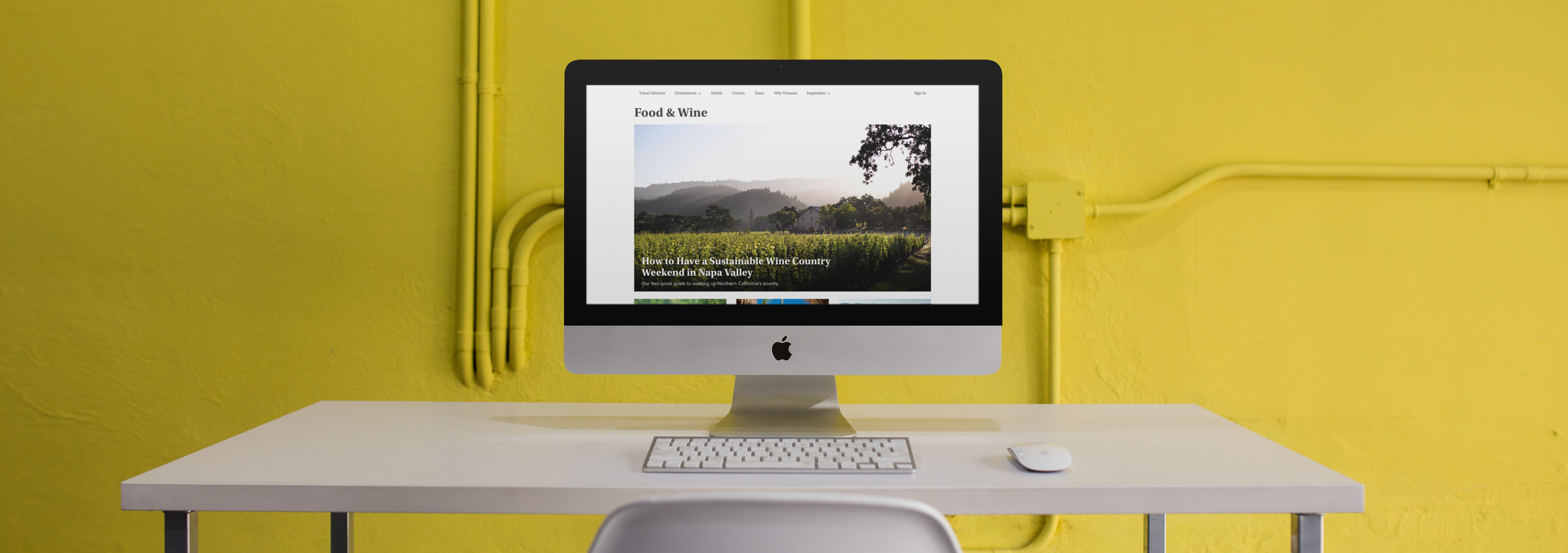
Three rounds of usertesting was performed on the intial designs and wireframes.
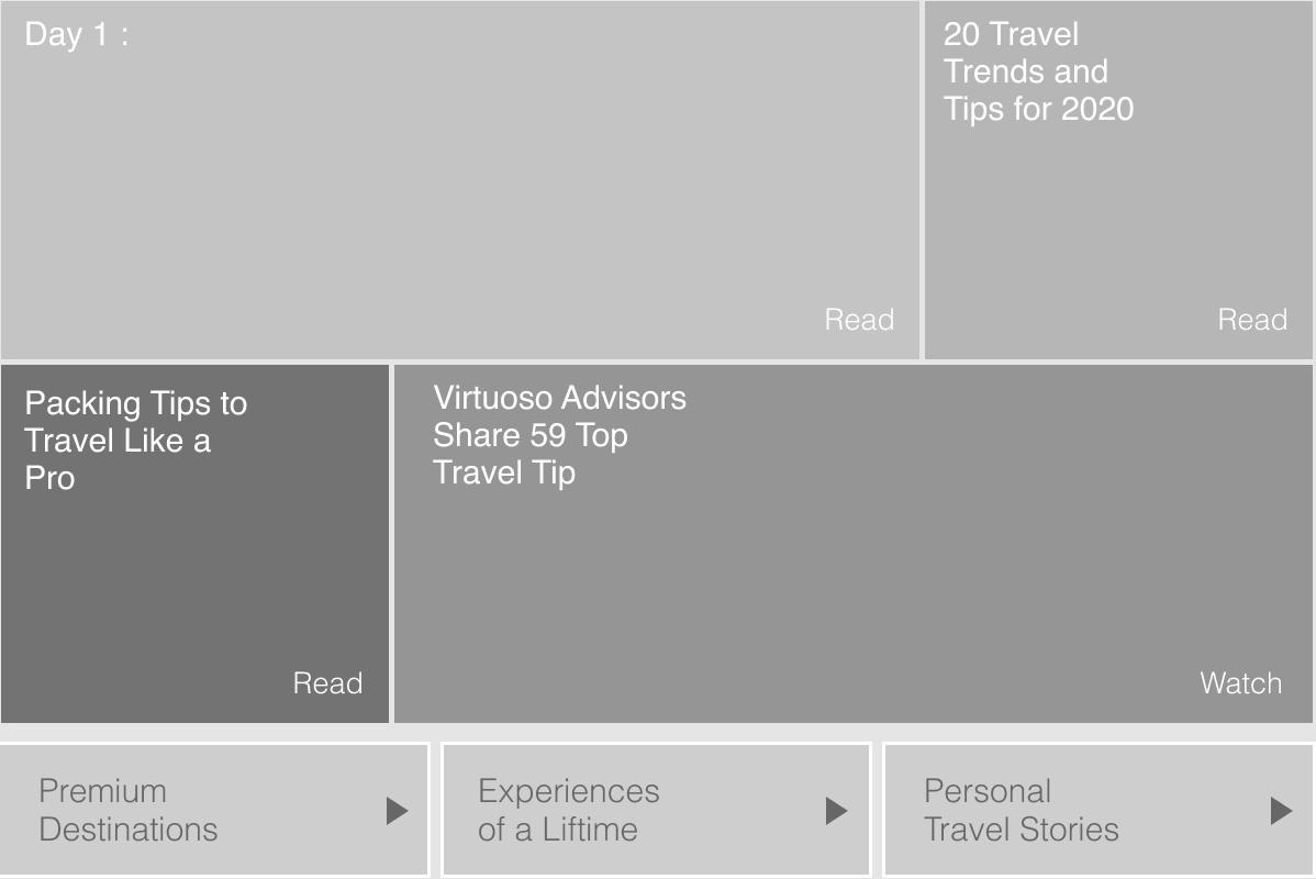
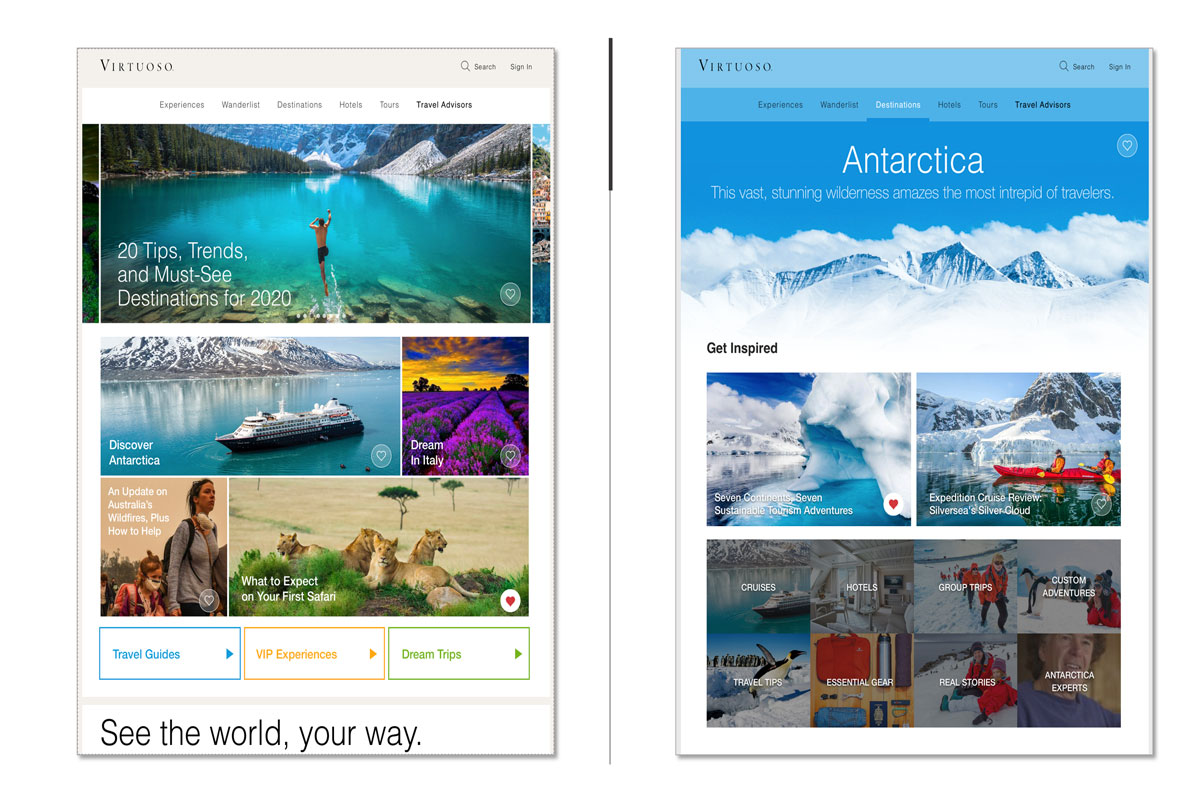
Asking the right questions led to the best user-tested solution which included removing the seperate consumer mobile site, adopting a new CMS and creating mobile-first designs.
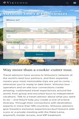
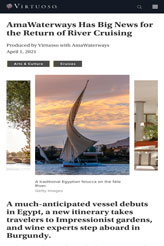
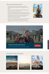
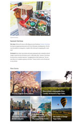
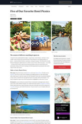
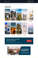
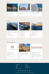
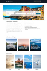
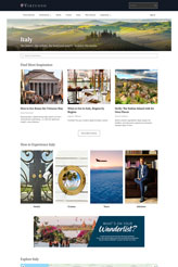
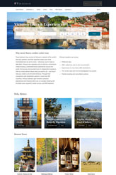
The header and footer were also updated for a more optimal consumer experience.


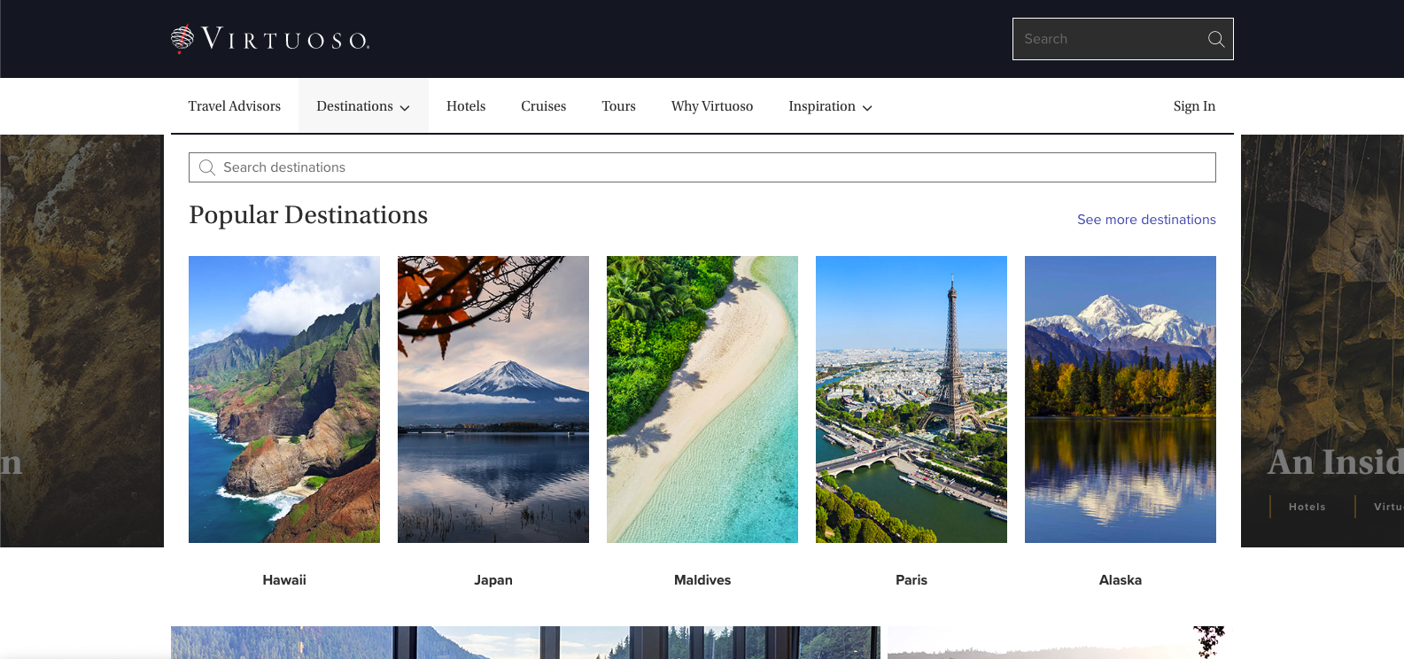
New Destination page mega menu


Since the October relaunch of Virtuoso.com, page views are up 45%, visit duration is up 15%, unique users up 50%, pages per session is up 15% and bounce rate has dropped nearly 30%. Our service team also reported a marked drop in the number of enquiries about how to connect with an advisor, which demonstrates an increase in ease of understanding.

This redesign validated our hypothesis that the most effective value proposition is one that is centered around a person’s core motivation. I’m looking forward to applying the same approach to other key pages of the site as the point person for upcoming B2B redesigns.
Are you working on something great? I would love to help make it happen! Drop me a note and start your project right now!